We Have a New Logo!
If you have been involved with or followed our work for awhile, you may have noticed a new logo starting to pop up on some of our resources. We will gradually transition to the new logo over the coming months for most materials. In the meantime, we would love to share a bit about the history and significance of both logos, as well as why we decided to change.
Hey – We Should Have a Logo
Our original logo was created very quickly, more or less overnight, during the early weeks of our response to hurricane Helene in western North Carolina.
We realized that we needed something quickly recognizable that would help build trust in the community – a way for our volunteers be seen as part of an organization rather than individuals and that marked us as a local group, not representatives of the federal government or from out of state. These factors were especially important because we were working in Appalachia, where trust of locals FAR outweighs government or strangers coming in from other areas. Ironically, we were only able to help as much as we did because we had so many people coming from other areas to assist, so we needed a way to tie those temporary volunteers to our wonderful and consistent locals.
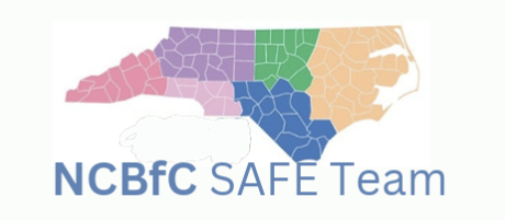
The yellow and olive one was not actually our first logo. The first one we used was a temporary solution using a NC county map and our group name. In some of our materials, you may see pictures of some kits carrying a sticker with this initial logo. The decision was made relatively quickly to develop a logo that was more distinctive.
The logo helped. We consciously chose a visual of North Carolina to show our grounding in this area. The SAFE team was started by North Carolinians, and our board is still majority North Carolina residents. We included an abstract line representing the mountains, river, or both that we have come to call the “swoosh.” NCBFC made the team’s association with the North Carolina Breastfeeding Coalition (the SAFE Team started as a collaborative effort between NCBFC and Breastfeeding Family Friendly Communities) obvious to anyone who knows the acronym or wanted to look it up. It was recognizable and instantly said, “We’re from right here!” The sites we worked with came to recognize our logo and look forward to seeing our volunteers bringing the sanitation kits
Don’t You Just Work in NC?
The original logo served us well through our entire deployment in western NC. As 2025 progressed, the core members of the SAFE Team continued to define and refine our role in IYCF-E moving forward. We became passionate about helping bring more awareness to IYCF-E and reduce the incidence in future emergencies of the issues we had encountered in WNC. When Love’s attendance at the 2025 national VOAD conference prompted the realization that lack of IYCF-E integration into preparedness plans was not just a problem in western North Carolina but nationwide, we stepped up our national efforts.
This created a conflict with our logo. Talking with governments in other states was often met with subtle resistance. National conversations were met with the expectation that we only had a North Carolina perspective and it took some adjustment for them to understand that some of our board members are from states outside the southeast and we were now acting nationally. Occasionally the issue was verbalized: our logo and overt association with the NC Breastfeeding Coalition made us look limited.
We Need a New Logo…
Even once we realized the necessity, it took some time to develop a new logo. We wanted it to be a visual representation of what we do, while also maintaining some honoring of our roots in WNC.
Through a joint effort, we ended up with our new logo, showing a parent with a baby, protecting them from representations of some natural disasters. The new logo also maintains the mountain/river “swoosh” in the background, flipped and slightly extended.
We will continue to use our NCBFC logo in some of our work that is only for North Carolina. So don’t be confused if you see both occasionally.
We are pleased with our new logo, and hope that you will come to see it as a sign of the care, support, and quality that we try to maintain in everything we do.